🏆 CORE77 Design Awardee 2020
Recognized internationally by Core77 Design Awards as a Community Choice Prize Winner and Student Honoree in Consumer Technology.
Case Study | Carnegie Mellon University
Chef - Conversational AI for culinary experiences with Blue Apron.
TEAM
Anna Boyle, Amrita Khoshoo, Deepika Dixit, Yiwei Huang
TOOLS
Adobe XD, After Effects, Adobe Illustrator
MY ROLE
Concept Development, Project Management, Design Research, Visual Design, UX/UI Prototyping
TIMELINE
7 Weeks

OVERVIEW
Our challenge was to design a virtual assistant for an existing brand that would benefit from emerging AI solutions.
Our team researched and tested what services would benefit from AI and emerging technology and designed a digital AI system across multiple platforms through form, motion, style, and conversation.
WHY DESIGN AI FOR BLUE APRON?
Cooking is a task-based communal activity that usually requires both hands and oftentimes a piece of technology.
There was an opportunity for a virtual assistant to anticipate and aid with tasks while guiding multiple users through the cooking experience.

OUTCOME
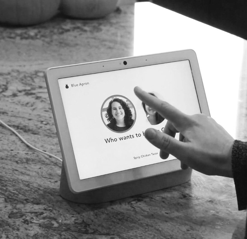
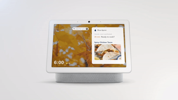
Chef - is accessible on Blue Apron’s mobile app and Google Nest Hub Max smart home display.


Chef is composed of 5 key features including, collaborative multiuser cooking, personalized dietary options, smart controls, food recognition, and tracking food intake.
FEATURE SET
1.0
Personalized Dietary Options
Chef makes personalized meal recommendations based on user preferences and third-party data.
2.0
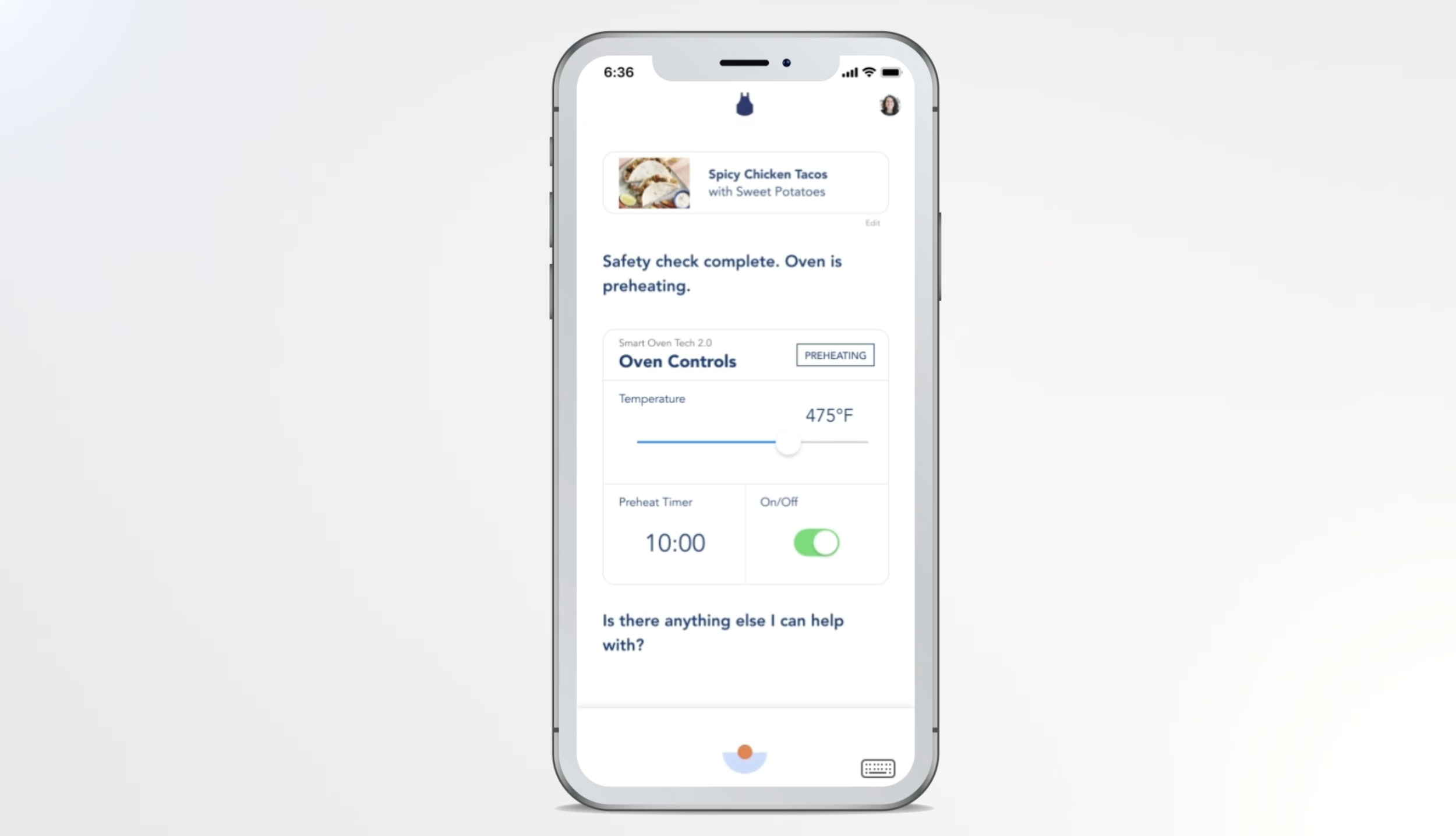
Smart Controls
Chef connects to smart kitchen appliances for a streamlined cooking experience.
3.0
Collaborative Multiuser Cooking
Chef connects to smart kitchen appliances for a streamlined cooking experience.

4.0
Food Recognition
Chef uses food recognition to log meals and make recipe substitutions.

5.0
Tracking Food Intake
Chef customizes future meal recommendations based on personal taste.

1.0.
Exploratory Research Process
After choosing Blue Apron, we explored the brand in terms of visual brand language, the target audience, and the tone of the virtual assistant.
BRAND ANALYSIS
Visual Brand Language
The Blue Apron brand exhibited a strong, bold, and dynamic style. Its distinct illustration style was clean, friendly, and personalized.
Accessible, wholesome, and fun while being reassuring, and calm.
The Tone
We wanted the virtual assistant to provide helpful guidance throughout the cooking experience and to embody a sense of calm to counter anxiety often related to cooking.
An upbeat and optimistic companion, reassuring the user along the way
Target Audience
The largest proportion of Blue Apron’s user base is American women between the ages of 25–34.
We imagined our virtual assistant to be a male voice.

CURRENT USER EXPERIENCE
We conducted informal research on the current customer experience and had informal conversations with friends who had used the service and researched reviews online and on YouTube.
“There was a lot of waste involved. And it doesn't eliminate the fact that cooking is still hard. There's still a lot of prep work, multitasking, patience...”
USER JOURNEY MAPPING
We outlined the user journey to understand the process of cooking using the Blue Apron meal kit through one of their recipes.
Tasks were identified; before, during, and after the process of meal preparation and then associated with user emotions. We mapped the tone of the AI in response to the user to gain a better understanding of the interaction between the user and the technology.
VISUAL FORM
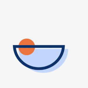
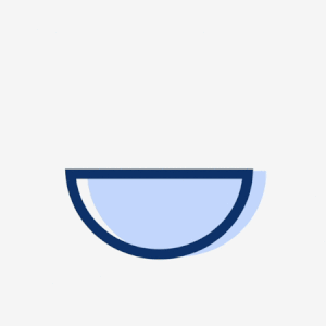
When defining the visual form, we abstracted some of the illustrations of Blue Apron’s cooking utensils and landed on the visual form of a bowl and ingredient.
Chef is composed of three elements: a fill bowl shape, an outline bowl shape, and a circular shape representing an abstract ingredient. We chose the colors based on Blue Apron’s primary and secondary color schemes.
MOTION AND EXPRESSION
Through our process of refining the motion we referred to the AI response states we outlined in our research and user flow map to help guide our iterations and design decisions.
As a team, we worked together to determine the transitions and motions for Chef while adhering to the brand language and tone of Blue Apron.

FINAL ANIMATIONS + EXPRESSIONS

Base/ Ideal

Thinking/ No Results

Speaking
Timer On

Listening

Timer Done
Thinking

Meal Complete
2.0.
Evaluative Research Process
Following our exploratory research and the development of the visual form, we tested our conversational design to evaluate how Chef could assist user needs and adapt to different environments in the kitchen.
USER TEST KITCHEN
In this exercise, I was the cook, and Amrita verbalized Chef’s actions. During this research experiment, we identified three design considerations that helped influence updates to our mobile interface and Google Nest Hub Max.
These updates included updating conversational design, providing personalized appliance settings, and adding visual indications to the cooking experience.
1.0 Updating Conversational Design
Measuring ingredients became confusing with just numerical descriptions and I ended up pouring too much olive oil and pasta sauce into a pan.
This influenced how we approached our conversational design, by making conversation informative and relatable. As a team, we worked together to determine the transitions and motions for Chef while adhering to the brand language and tone of Blue Apron.
2.0 Personalized Appliance Settings
The oven preheated faster than expected which ended up cutting the cooking time of our pizza in half.
This led us to provide more personalized appliance settings. In our scenario, Chef is connected to a smart device and Chef knows the presets of the device.
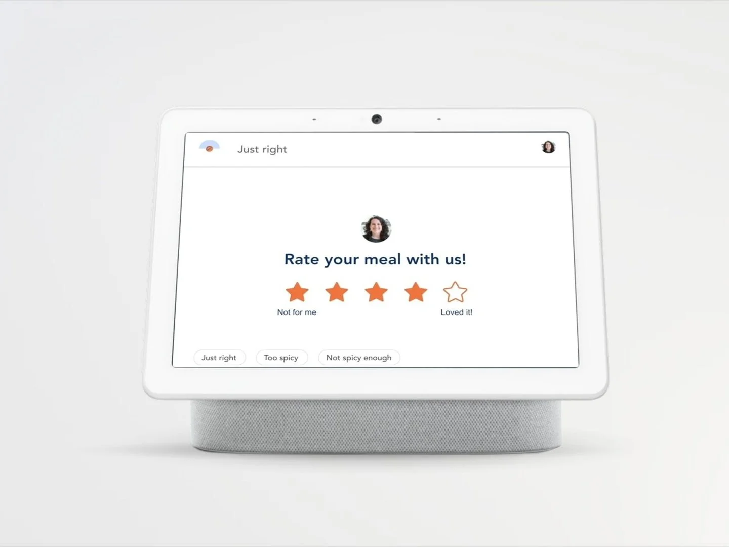
3.0 Adding Visual Indicators
There was confusion about the expectation of the final outcome of the meal and what it should look and taste like.
This led us to provide more context to our final designs by conveying more information through pictures and descriptions.
3.0.
Ideation Process
Our ideation process began with designing the mobile cooking experience and testing that AI concept in the user test kitchen. We then expanded the mobile app experience across platforms to the Google Nest Hub Max.
UX/UI | MOBILE
Our initial Mobile UI design walks a single user through the Blue Apron cooking experience. Our first iteration of the UI was visually influenced by the current Blue Apron App and included the following additional functionality.
Real-time meal substitutions and recommendations, remembering food preferences for friends or family and setting multiple timers.
V.1 UX/UI | MOBILE
V.2 UX/UI | MOBILE
GOOGLE NEST HUB MAX UI/UX
When designing the UI for the Google Nest Hub Max we developed a design that matched the look and feel of our mobile experience but also considered the design of Google Nest Hub Max and the Google Assistant integration. To ensure that the application of our design was accurate we purchased a Google Nest Hub Max to help us identify and implement existing macro and micro-interactions.
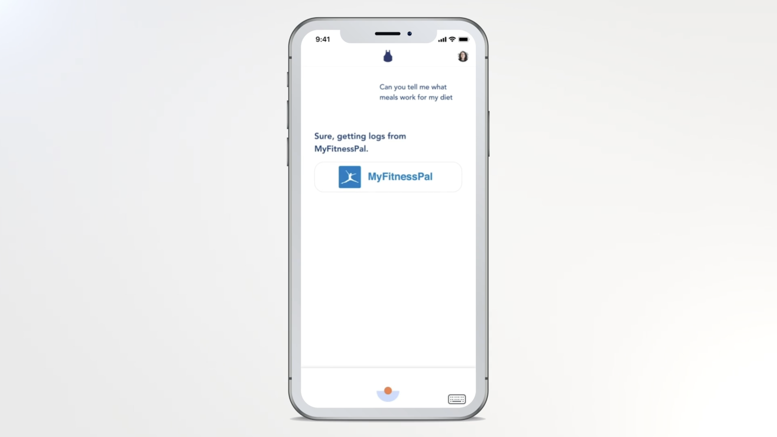
Visual cooking timeline, voice and face recognition, gesture control for a hands-free experience, and integration and references to third-party apps like Spotify, Pandora, Netflix, MyFitness Pal, FitBit, and YouTube.


BLUE ARPON ECOSYSTEM
REFLECTION
Designing Conversations
How to create user-centered conversations both in terms of the user interface and user interactions.
With user interface design, less is always more. An intuitive and clean user interface is more intuitive.
Inspired by Google’s AI Design Guidelines we used their principles to guide our work. This included using short, simple, concise words and prompting users with task-oriented responses.
Value Sensitive Design
Value-sensitive design, or thinking about how human values factor into what we’re doing, influenced our decision process while defining the autonomy of our virtual assistant.
Thinking through how a Chef takes action and communicates his actions were also considered.
We had in-depth discussions and made key decisions around user consent and control
Prototyping & Testing
Prototyping and testing are fundamental. The insights from our test kitchen experience played a larger role in our final design.